Brian McPhee at The Capitol Bar

20/10/2023

East Hamilton is well worth a cultural visit until the end of November. The very cool The Capitol Bar is hosting an exhibition of watercolours and gouaches by Brian McPhee, alias 13brokenhorses. The artist will be present on Sunday, October 22 from 5-7pm.

Eight striking 22×30″ watercolour paintings command the room and draw the eye to the more intimate, but no less exciting, gouaches. The work is extremely affordable and Brian can be reached at 13brokenhorses@gmail.com for details.

This blog has always been about the educational and instructional side of art with some inevitable self-promotion of my own work. With that in mind, I’m going to tell you a bit about Brian’s process and materials and offer a few of my thoughts on his work.

First, a bit about Brian. He currently teaches painting at Sheridan College, where he is well-established. Past teaching gigs include OCADU, Humber and Seneca Colleges. As a young artist and student, he was very close to Chinkok Tan, a Toronto artist who has taught and painted in central and eastern Canada for decades. Brian came to my attention early on while I taught on Grand Manan Island. Many Grand Manan homes and cottages were adorned with postcards and prints of two powerful McPhee watercolours; one of the famous Swallowtail Lighthouse and peninsula and the other of clamdiggers harvesting at low tide.

Brian is a huge fan of Andrew Wyeth and Edward Hopper. As a young man, he once tracked down Wyeth at his rural, secluded home and was determined to show his armload of watercolours to the master. He was not warmly welcomed by Mrs. Wyeth and was told that Andrew was at work in his barn studio and NOT to be disturbed. Excitement and a youthful rashness prompted Brian to sneak over to the barn and look in the window. Andrew was quite elderly at the time but Brian describes him as ‘dancing’ as he painted. Mrs. Wyeth quickly spotted the young interloper and a very hasty retreat was in order.

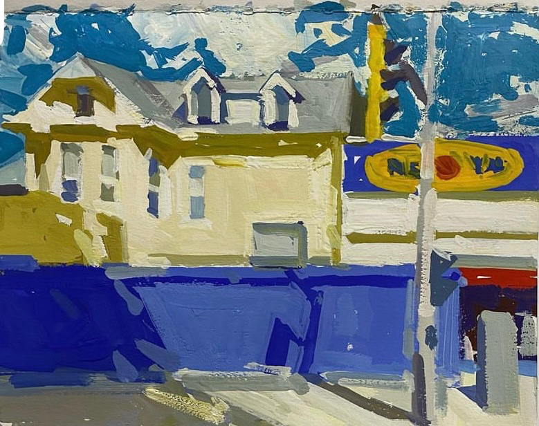
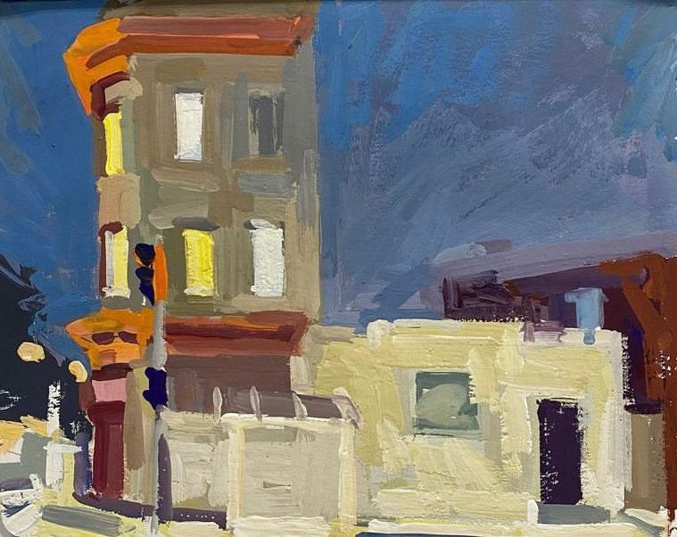
The subject matter from the current exhibition is inspired by the Stipley neighbourhood of Hamilton and from a recent trip to Glasgow. A few images from Newfoundland are also featured. The two watercolours shown below are scenes from Trinity Bay in Newfoundland and have been hung side by side as a potential diptych.

Much of Brian’s career work has been painted ‘en plein air’ but these watercolours were completed in his studio, working upright at his easel. They are made from a blend of sketches and photo reference. The Arches Cold Press paper (140 lb.) is unstretched and clipped at the corners. He uses large Skoda Kolinsky brushes, #14 and #16. His colours mainly include a mix of Winsor & Newton and Lukas although he has worked with Da Vinci (the paints, that is) in the past. Paper white provides the luminosity of the lightest areas but there has been some recent experimentation with opaque white; in this case Buff Titanium from Daniel Smith. It’s been employed particularly in some of the skies in an attempt to create atmospheric conditions. A faint, preliminary pencil line can be seen in some of the lighter areas. Brian is an expert ‘shape reader’, who painted without any prior pencil strokes for many years but he now finds it helpful to map out the overall composition.

The small gouaches were made on a variety of papers, mostly in sketchbooks. He uses a variety of traditional gouache brands and is considering some trial use of the newer acrylic gouache. The brushes are inexpensive Princeton Velvettouch, #5 or #6. These little painting gems are only 7×10 to 8×11″ but they pack an immediacy and painterly quality that rivals the small oil panels created in the field by the Group of Seven. Also, can you see an echo of David Milne in the painting directly below? I sure can. Brian calls gouache ‘the Devil’s medium’! If that means that it’s a challenge then he’s definitely risen to the occasion.

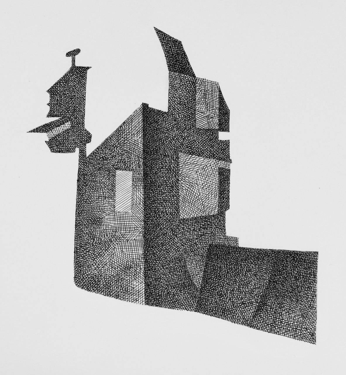
Broad, expressive brushwork is a hallmark of Brian’s style. My art school mentor, the late Hugh Mackenzie, talked passionately about ‘the physical act of painting’. These gutsy, vivacious works exemplify that idea. If you know my work it will likely come as no surprise that I also see a fair bit of underlying geometry in these paintings and not just because most of the subjects are architectural. The work above is a good example.

My longtime and wonderful students may have a question for me. They’ve heard me harp about ‘edge issues’ in composition and how they can potentially distract the eye. Brian flirts with the edge frequently and, in doing so, he reminds me of the contemporary American painter, Mitchell Johnson. That’s a compliment. Johnson’s bold and colourful work, much of which is based on the urban environment, is quite often very tightly cropped and narrowly skirts the edges of the rectangle. Does it lend a powerful, dynamic quality to the work or does it bother the viewer? You decide. Despite my warnings to students, which I believe are valid and should be at least considered as one learns the basics of composition, I’m a big fan of the work of both Johnson and McPhee.

Drop by The Capitol Bar. If you can make it this Sunday, you’ll recognize Brian from the self-portrait below. In the meantime, view his website at http://www.13brokenhorses.com/.

Watercolour Exhibition at GMAG!

23/08/2023

I’m exhibiting a collection of watercolour paintings in Gallery Two of the Grand Manan Art Gallery from August 20 – September 8, 2023. Almost all of these paintings were made in the early 1990s. I first came to the island in 1991 to teach ‘en plein air’ drawing and watercolour workshops.

Many of the scenes, lighthouses and buildings I painted have been altered by time. Some of the structures are long gone, like the Ross Island Light. Wooden objects like lobster traps and boxes have long been replaced with metal and plastics. Still, the island is a very beautiful and inspirational place!

Sincere thanks go to the entire gallery committee, in particular my hard-working and indispensable friend, David Ogilvie. This evening (Wednesday, August 23) at 7pm, I’ll be offering an illustrated talk featuring my sketches done over three decades of summer visits to the island. Drop by if you’re in the neighbourhood.

View the paintings and details individually at: https://barrycoombs.wordpress.com/grand-manan-art-gallery-watercolour-exhibition/

Upcoming Exhibitions This Summer!

24/07/2023

I’ll be exhibiting a collection of 22 watercolour paintings at the Grand Manan Art Gallery from August 20 – September 8, 2023. These watercolours are mostly from my  visits to the island in the early 1990s. For more information about the exhibition and to view the work, please click on the Grand Manan Watercolour Exhibition page to the right or here. GMAG is located on beautiful Grand Manan Island, New Brunswick, Canada.

As a new artist member of the Carnegie Gallery in Dundas, Ontario, I’ll be participating in the Artist Member Exhibition, CG23 from August 4 – 30, 2023. Join us at the Opening Reception from 7-9:30pm on Friday, August 4.

View my profile and see more of my work at the gallery here.

Two Birds in Watercolour

13/02/2021

A while back, I posted a step-by-step pen and ink drawing of a Northern Mockingbird. The post may be viewed here. Occasionally, I paint birds in watercolour, as well. I’ve done a few recently and I thought I’d show you a bit of my process.

Several years ago, I was teaching an en plein air watercolour class on the Toronto waterfront. It was during the month of June and the trees were alive with busy local nesting birds. At one point, I reached for my binoculars to check out the source of some particularly harsh squalling. It was a fledgling, a young bird that had only very recently left the nest. It was one of the ugliest creatures I’d ever seen and I didn’t know what species it was until a parent dropped by with a beakfull of nourishment for the hungry youngster. I won’t reveal the species right away. Let’s talk about my process.

I worked from my own photo back in the studio. I print both a colour and a black and white version. The black and white version helps me see and understand the values. I grid the colour version and then draw a rectangle of the exact same proportion on my paper. I used a small block of Arches, Hot Press, 140lb., watercolour paper. Using the grid, I draw the bird with a very light touch of a soft 2B pencil. The pencil lines are quite faint and hard to see but easy to clean up with an eraser. For the sake of this post, I strengthened the drawing so that it would be clearer.

Step One of Fledgling

So far, the first step is identical to what I did with my pen and ink drawing of the Northern Mockingbird. This is a watercolour, however. Step Two means it’s time to paint. I mix Burnt Sienna with Cobalt Blue in order to create a cool/neutral grey. In Step Two I painted a narrow range of values to show the darker areas of the bird and also to suggest texture.

Step Two of Fledgling

Local colour is introduced with Step Three. Our fledging is a fairly colourful creature. I ‘glaze’ thin washes of colour where needed.

Step Three of Fledgling

Step Four is really a series of steps as I continue to develop colour and value. I step back a lot and take short breaks. The stepbacks and breaks are just as important as touching the brush to the paper. Eventually, the painting is finished.

Step Four of Fledgling

By the way, I don’t use opaque white paint. I reserve the white of the paper. It’s challenging, especially when there are white areas on the bird. Can you guess the species? It’s a young Red-winged Blackbird.

I’ll show you one more bird painting while I have your attention. It’s another common urban bird and this time I’ll just show two steps. Here is the ‘monochromatic’ stage of this study of a House Sparrow. Again, I’ve used a few values at this point.

Study of House Sparrow

The House Sparrow is not a colourful bird, at all. I stuck with the combination of Burnt Sienna and Cobalt Blue for the entire painting. Also, I gradually darken these paintings as the ‘light to dark’ process is very forgiving. These paintings are quite small, only 4 by 5 inches or so. The image on your screen is probably larger than the actual watercolour study. I hope you find this approach useful for working from your own photographs. It’s just one way to do it as, of course, there are likely as many ways to paint birds as there are artists. If you’d like to view more of my bird studies, click here.

Northern Mockingbird – Pen and Ink

26/01/2021

My hobby is birding. I’m quite passionate about it, as I am about art, and occasionally these two loves of my life converge. I don’t draw or paint birds very often although I tell myself that I should. I’ve taught a few workshops on the subject and have enjoyed the enthusiasm and talent that the students have shown.

I have a birding blog that may be seen here. If you’d like, have a look at the Drawings and Paintings page. Recently, I was updating the page and something moved me to draw a new bird. A Northern Mockingbird I photographed last week had been on my mind and I decided to give it a go. Then, realizing that I hadn’t posted on this blog in eons, I thought I’d scan the main steps and tell you a bit about my process.

The Drawing Board

I’ll start with the tools of the trade and my initial process. I work from my own photographs, which can be limiting because my camera skills are pedestrian. Still, once in a while I luck out and I had a nice image of the Northern Mockingbird (NOMO from here on). I duplicate the photo on my computer and convert the duplicate to black and white so I can better see the values. I grid the photo for accuracy. In this case, I wanted the drawing to be about 3/4 the size of the photo so I created a smaller rectangle of the exact same proportions and then gridded it. I work with a soft 2B pencil for all of the preliminary drawing. The softer the pencil, and lighter the touch, the easier it is to clean up the drawing later on with a kneaded eraser.

Evaluating the photograph at the outset is very important. Is anything unclear or confusing? In this case, I edited out several branches. Another concern was the bird’s tail. NOMOs have very long tails and the tilt of the body foreshortens the tail as it’s pointing slightly towards the viewer. I liked the pose, despite the potentially misleading tail position, and went ahead with it.

Step One

Next, I begin work with the pen and ink. I work with a traditional dipping pen. The Speedball nib is inserted into a holder. My ink of choice, since my teen years, is Speedball Super Black India Ink. I won’t bore you with every detail but I’m careful with how I dip and handle the pen to the point of ritual. Something works. I haven’t had a tragic blob in a long, long time. Note the ‘test’ sheet under the pen and pencil, though. It’s an indispensable tool. Note, also, the crumpled, ink-stained paper towel on the left. I’m obsessive about keeping my nib clean.

Tools of the Trade

I’m versed in many basic pen techniques and have taught them for decades. On my own, I have a few favourites and cross-hatching has always been foremost. My second step with the drawing is to explore the forms and, critically, to identify areas of the paper that will remain white. Stroke direction is fairly intuitive although I generally try to describe the underlying planes. The whole drawing is addressed once with these directional strokes (hatching). The cross-hatching comes next.

Step Two

Step Three is an effort to develop the relationships between the values. For the most part, the different areas are cross-hatched once only so the newer strokes overlap the original strokes just once. Yes, I’m patient. This step starts to show the different values in the plumage of the NOMO. This species displays a lovely, subtle range of greys and blacks with a brown eye. In a monochromatic drawing, these elements can only be suggested.

Step Three

In Step Four, I do a lot of work on the darks and blacks. While remaining as true as possible to plumage details, my goal is to give the drawing the strength and vitality of this beautiful, living creature. I don’t rush Step Four and take lots of breaks.

Step Four

Eventually, after long looks from several feet away, I call it a finished drawing. The unresolved look of the upper branch, still at Step Two, is deliberate. The drawing is approximately 7 x 8″. It’s on Strathmore Bristol paper, vellum surface.

LOCKDOWN DRAWINGS

24/08/2020

I’ve been doing a lot of pen and ink drawing during the pandemic. I use a traditional dipping pen with Speedball nibs, Speedball Super Black India Ink and, for some of the drawings, acrylic ink. Cross-hatching is the technique I employ. Cross-hatching with a pen has been one of my favourite creative activities since childhood. It relaxes me and allows me to gradually develop a range of values.

Lockdown Drawings reference photo

The starting point for these drawings is a rather ordinary photo I took of a back alley in Hamilton, Ontario. The cast/core shadow pattern had attracted me. I refined an overall shape from the pattern in the photo.

Lockdown Drawing #1

Each drawing is a variation of the shape and stays within it’s confines except for the occasional wandering line; a fairly obvious analogy of my behaviour during the lockdown.

Lockdown Drawing #2

My goal was to explore the infinite variety of options within a limited shape. Tonal gradations and the internal geometry of the shape are key concerns. The subtle gold lines in #2 are drawn with FW Artists Ink Gold, an acrylic ink.

Lockdown Drawing #3

Lockdown Drawing #4

Gold ink is used again in #3 and #4. These reproductions do not show the reflective quality of the gold ink. The originals definitely profit from the ‘gilt’ shine.

These are small drawings, approx. 8×8″. To date, there are sixteen drawings in the series.

Winter Wednesday Watercolour Class at DVSA – Week Four!

15/03/2020

Last Wednesday, I was back at Dundas Valley School of Art. It was the final evening class in a short series of four. My demonstrations on the first three nights had focused on various fundamentals of process and technique. What to do for the final evening?

I decided to paint a small work (7 x 6″) from start to finish. I followed a forgiving light to dark and big to small process. I worked quickly and discussed my thoughts and decisions as I painted. I completed it in about 32 minutes thanks to a handy hair dryer. I rarely do a whole painting as a demonstration but, once in a while, I think the students can benefit from seeing all of the steps.

Something clicked. This group has been a pleasure to work with and their progress over four short evenings has been remarkable. Click on the critique image to view a larger version.

That’s it until spring term. The schedule is up in the air right now due to the coronavirus. Most of us will be spending much more time at home for the next while. If so, paint a lot and stay well!

Wednesday Evening Critique

Winter Watercolour Classes at Arts on Adrian – Week Three!

11/03/2020

Cabinet of curios? Treasure Chest? Ye Olde Antique Shoppe? Whatever you want to call it, this still-life offered a variety of opportunities for the watercolour students.

The Sustained Saturday group was first up. I discussed the subtle colours of the still-life; earthy browns and varied greys. Brasses and coppers. I restricted myself to primary colours (yellow, red and blue) and used the three of them to mix all other hues. Why did I do that? Try it sometime. You’ll learn a lot about colour and your palette if you limit yourself to the primaries. Also, your colours will tend to harmonize more successfully when you employ less of them.

As usual, I urged the students to zoom in on an area of interest. I never suggest that they paint the entire still-life. As they work on their thumbnail compositional studies, I walk around the studio and offer my thoughts. The group enjoyed the still-life and their pleasure is evident in the day’s work.

Sustained Saturday Critique

My demonstration for the Tuesday class focused on the same ideas. I showed them the demo sheet from Saturday, as well.

The Tuesday afternoon group also responded enthusiastically to the subject matter. I’m amazed at what they can achieve in three short hours.

Tuesday Afternoon Critique

Currently, I’m planning spring classes and they’ll be posted on this blog in a few days. I’ll send out my usual email notification, too. Of course, the coronavirus may ultimately affect the spring schedule and I’ll address that when I promote the classes. In the meantime, wash your hands and stay well!

Winter Wednesday Watercolour at DVSA – Week Three!

06/03/2020

Thanks for all of your comments about the value of critiques last week! I think that most of us consider the critique to be an indispensable element of an art class.

I chose these colourful gift bags for our still-life at Dundas Valley School of Art on Wednesday evening. First of all, the colours are cheerful. Secondly, the broad, flat planes allowed me to deal with applying even, ungraded washes for my demonstration. I painted the overall shape of this green bag first and strove to keep the wash consistent and without streaks or blossoms.

Following that, I continued to develop the bag, guided by a light to dark and big to small process. I used soft-edge techniques to show value transitions on the ribbon.

It was only our third class (one more to go) and I’m pleased with the progress already. There’s a lot to deal with in the world of observational painting; drawing, composing, grasping light and shadow, brush-handling and more!

Wednesday Critique

Winter Wednesday Watercolour at DVSA – Week Two!

27/02/2020

Last night, I was at Dundas Valley School of Art for the second evening of a four-week watercolour class based on the still-life. As I mentioned last week, the students are a balanced mix of ‘regulars’ and new. By ‘regulars’, I mean students who have done at least two prior still-life courses with me, more than that in some cases. Although this class is not intended for novices, most of the new students have no prior experience with observational work but have taken other watercolour classes at some time.

How does an instructor handle a group of students with various levels of skill and experience? First of all, in the world of non-credit adult education, this is the norm. I’ve been teaching adults for thirty-two years and this has always been the case wherever I’ve taught. So, back to the question.

Last week, I didn’t know the new students at all. My demonstration dealt with the fundamental issue of observational work. Find the light! Also, I briefly touched on soft-edge techniques. We got started and, as I walked around the studio, observing and offering feedback, I quickly grasped the skill levels of the new students.

The thing about traditional, observational work is that watercolour technique is only a partner to the basics of drawing and understanding light and shadow. It’s very challenging to new students especially if they don’t have much of a background in drawing. As I walked around, I felt that all of the new students were able to draw the subject competently. The general grasp of light and shadow was less accomplished but that’s often the case with much more experienced students. This is why I chose the topic for the first demonstration last week.

I started the second class with a demonstration for the whole group. You can see it on the left side of the sheet. A bit of everything was discussed; light and shadow, the value and colour relationships between the various objects and soft-edge technique. Then, I asked the ‘regulars’ to get to work and I kept the new students with me for a few more minutes. The right side of the sheet illustrates my talk about creating soft edges, a core watercolour technique. After this supplementary lesson, the new students got to work.

Back to the question again. This is one way that I deal with a group of students with various levels of skill and experience. I do other things, as well. I suggested that the new students consider a sheet of studies of individual objects rather than tackling a full composition, for example. Also, I constantly stress process over product. To the new student, their first four evenings of still-life painting are merely an introduction to the process. It’s a learning experience. The regulars continue to develop their observational and watercolour skills as well as their grasp of colour and composition, also a learning experience.

I’ve enjoyed the first two evenings. Everyone has worked hard. Our attendance was diminished a bit by a winter storm but we still had a lot to look at for our critique at the end of the class. The critique, by the way, is a critical part of the learning experience but not the only opportunity to learn. The engaged students will learn a lot from each other as they walk around during breaks and look at the other paintings in progress as well as during the critique. I offer constructive critiques and I emphasize that the critique is not a competition but an opportunity to learn from the feedback given to every participant.

I’ve written a lengthy post now and only scratched the surface about adult studio-based art classes. Before we look at the paintings from last night, I have a question for you. How much do you value critiques in the art classes you’ve taken? Please, comment.

Wednesday Critique